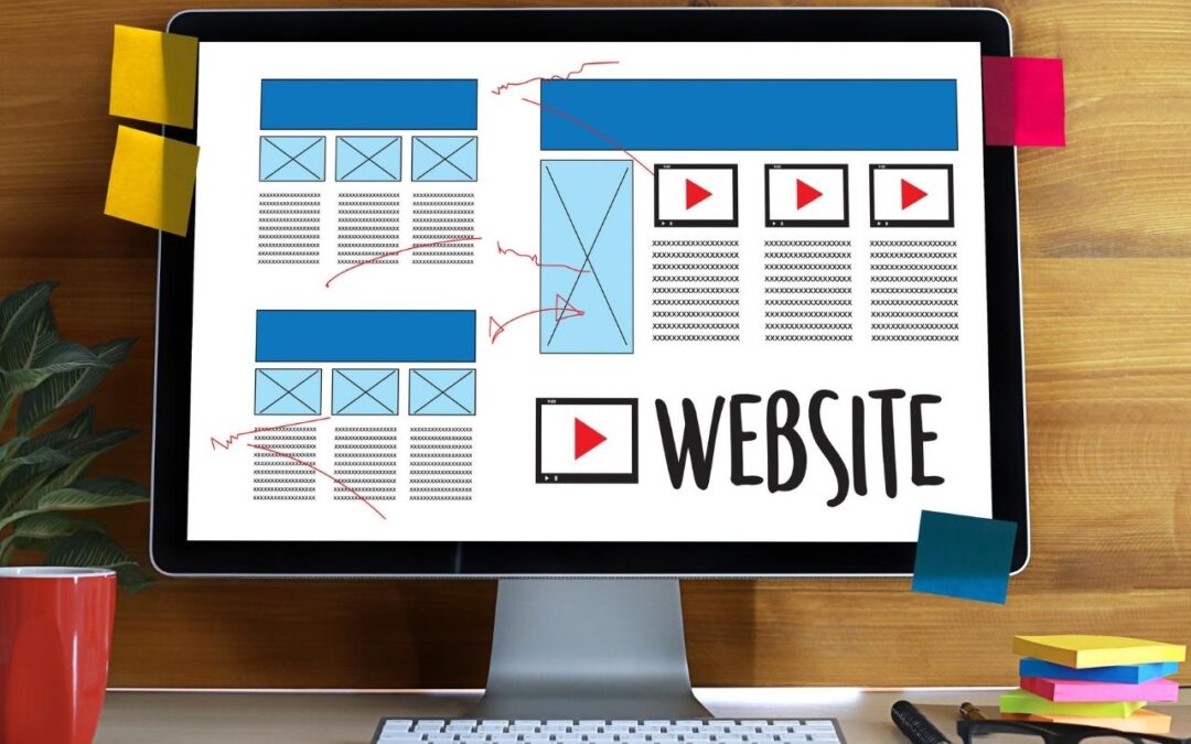
The 5 Must-Haves for a Solid Church Website
Your church’s website is more important than ever.
So why are so many of them, well….awful?
Many of them look ok aesthetically, however, they are often missing incredibly important information, full of language that isn’t clear, or failing to promote the church’s main vision and goals.
After working with many churches to create or improve their website and web presence, we’ve determined that there are at least 5 major items that every church website should include. Without these things, it could frustrate visitors and members alike enough to avoid the experience altogether.
Here are 5 things your church website needs:
Your Church Website needs a Message that answers the most important question
On of the most important questions is “Why should I care?” If you put something generic like “welcome home” or “we saved a seat for you” that doesn’t really mean much. It’s nice, but it doesn’t tell a visitor why they should continue investigating your church or much less attend it. What problem is your church uniquely positioned to solve for the people of your community? The answer to that is why they should care.
And it has to be something that they care about, not something that you care about for them.
There once was a church that really knew how to do care ministry well. They had addiction classes, marriage classes, counseling, and lots of serving opportunities in the community. The first thing someone reads on the website of a church like that should be something to do with care ministry. Something that says “Here, we care about people and we’re going to want you to do that too.” Phrases like “You matter to God” or “A church where everyone feels cared for” may work in that case.
It’s important that you spend some time on this message. Many churches just throw this line away as an afterthought to the design of the page, but it is one of the first impressions visitors to your site will have of your church. Don’t waste it.
Your Church Website Needs Service Times and Address
Before someone ever scrolls or swipes, they should be able to find out what day and the time your services are. If you are doing online services only or if you have some kind of in-person combo with church online right now, make it clear what you’re doing and how to be part of it.
In the footer of your website, you need to put a physical address. This helps with local SEO, but more than that, it helps people actually attend your church!
Your Church Website Needs a Media Page
Basically, you have two different areas for sermon media: Live and On-Demand. Both links need to be on the home page, but the On-Demand should be a button and Live can be relegated to the menu.
Watching past sermons and services gives visitors a feel for what it’s like to attend your church as well as some of your theology and practice. If you help visitors visualize attending in-person or online they are more likely to do so.
Your Church Website Needs a Way to Connect with You
First of all, questions about your services, your student ministry, or if you require masks should be easy to find those answers without having to contact someone.
You don’t want them to have to go to the church Facebook page, find the pastor’s personal page which has an email address in the about section before they can talk to someone at the church. If it’s too hard, most people won’t jump through hoops to talk to someone.
It is also not a bad idea to have a place where visitors can join your email list. You may have to create someone to trade with them for their email address, as simply asking them to join your list to receive updates probably won’t work. Create a “5 Things to do in Our City” or “A guide to a Biblical Marriage” pdf that you will send them for signing up.
Your email list is a valuable property that, like your website, you have ownership rights to. So, grow it and use it well!
Your Church Website Needs a Giving Button
I hate talking about money, but it is imperative that your church provide an online option that is clear and easy to use. It is a call to action button that we recommend putting in the menu as the top right corner. Just like our website has a menu CTA, we think churches should follow this trend.
There are many online giving services out there that you can set up and link to easily. Even if you have a congregation that isn’t very tech-savvy, none of them are so complicated that they can’t be taught. Walk them through setup and giving with clear step-by-step instructions and a few short how-to videos you can make with Loom. We recommend putting them on your giving webpage for them to access every time if needed.
These basics are a great place to start when thinking about your church website. We help church partners enhance their existing site with these basics and more all the time and would love to take a look at your site too. Let’s talk about how we can serve you!